
Color is one of the fastest ways people recognise a brand. Before anyone reads your name, they notice the colors on your logo, website and social posts. A well-chosen palette makes a small business look established and consistent; a random one makes it look improvised.
The good news is that you do not need a design degree to choose brand colors. You need a clear idea of your brand and a simple process.
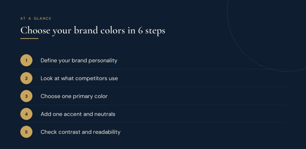
Why brand colors matter
- Recognition: a consistent palette helps people remember you across your website, social media and print.
- Emotion: colors carry associations that shape how people feel about your business.
- Clarity: a defined accent color tells visitors where to look and what to click.
Step 1: Define your brand personality
Write three to five words that describe how you want people to feel about your business, such as premium, calm and trustworthy, or bold, playful and energetic. Your colors should express those words.
Step 2: Understand common color associations
Color meanings are not universal rules, and culture and context change them. Still, some associations are common in many markets:
| Color | Often associated with |
|---|---|
| Navy and blue | Trust, stability, professionalism |
| Green | Growth, health, nature |
| Gold and yellow | Optimism, warmth, premium quality |
| Red | Energy, urgency, passion |
| Black | Luxury, sophistication |
| Neutral creams and greys | Calm, simplicity, balance |
Step 3: Look at your competitors
List the colors your main competitors use. If everyone in your industry uses blue, a different but still appropriate color can help you stand out.
Step 4: Build a simple palette
Most small businesses need only four to six colors:
- One primary color that represents your brand, used in your logo and key areas.
- One accent color for buttons, highlights and calls to action.
- Two or three neutrals for backgrounds and body text, such as an off-white, a light grey and a dark text color.
To explore combinations, try our free colour palette generator. A common guide is the 60-30-10 rule: about 60% neutral background, 30% primary color and 10% accent.
Step 5: Check contrast and accessibility
Text must be easy to read for everyone, including people with low vision. Test your text and background combinations with a contrast checker and aim to meet the Web Content Accessibility Guidelines (WCAG) contrast levels. Light grey text on white and yellow text on white often fail.
Step 6: Document your colors
Record each color's codes so they look the same everywhere:
- HEX for websites and digital design
- RGB for screens
- CMYK for print
Add simple usage rules, such as "accent color only for buttons and links", to your brand style guide.
Common mistakes to avoid
- Choosing colors only because you personally like them
- Using too many colors, so nothing stands out
- Forgetting to test how colors look in print and on different screens
- Changing shades slightly on every new design
Frequently asked questions
How many brand colors should a small business have?
Usually four to six: one primary, one accent and a few neutrals. Fewer colors make a brand easier to recognise.
Can I change my brand colors later?
Yes, but plan it as part of a rebrand and update every touchpoint at once to avoid confusion.
Should my website use exactly the same colors as my logo?
Yes. Your website, social media and printed materials should all use the same documented palette.
This article was first published on the Sayf & Co. blog.